Thursday 29 December 2016

Audience Research and Profiling:

Audience Research and Profiling:


The age certificate which we are aiming for our film to be rated at is 15, 15 certificate is given this age rating because the British Board of film classification state that in their opinion if a film is not suitable for the ages under 15 then they should not be watching it, this can include video recordings, games and films, this suggests that children under the age of 15 should not be watching or purchase anything if they are under the age stated. The reason this is a good age range for films and games is because making it 15 allows the audience to be bigger and more profit will be made for the film. The reason we have chosen to set our film in the 15 certificate because we think it gives the film more of an opportunity to be watched. We believe that if we set it in the 18 category then it would be restricted from having a bigger audience. 


Image result for non copyright picture of a teen audience

The picture above shows a group of teenagers, this is the type of audience which we expect to watch our film, this is because our film is not going to be very scary and we assume that 15 year olds will go to see the film in groups so if they are scared they will have all of their friends there to help them and comfort them. 

Shots used in our trailer:

Shots used in our trailer:


In our trailer we focused on close up shots, especially when Hannah is taken by the mystery Antagonist. This creates a very shocking effect because the audience are seeing the discomfort in which Hannah is feeling. We also used a range of different shots to make our Trailer as effect as possible, the shots include:


Long shots: "In photography, film making and video production, a long shot (sometimes referred to as a full shot or, and to remove ambiguity it will be called a, wide shot) typically shows the entire object or human figure and is usually intended to place it in some relation to its surroundings." 
Image result for long shot in media
This photograph is a good example of a long shot as it shows the characters full body and the surrounding of where the character is which sets the scene. We chose to use long shots in our trailer because it sets the scene of where we are and it also allows us to get more than one character in the scene. A long shot is usually shown at the beginning of the trailer because it allows the audience to see where the film is set, it also calms the audience especially in a horror film the audience are usually worried something bad is about to happen. 

Over the shoulder shot: "In film or video, an over the shoulder shot (also over shoulderab tuOTS, or third-person shot) is a shot of someone or something taken from the perspective or camera angle from the shoulder of another person."


Image result for over the shoulder shot in mediaThis photograph is a really good example of an over the should shot because it keeps the man hidden which keeps the identity of the character a mystery to the audience and adds secrecy to the horror film. An over the shoulder shot also allows the audience to see the emotion of the other character. An over the shoulder shot also makes the surroundings clear because it allows the audience to see what the character is looking at, it doesn't need to be looking at another character which is being shown. 


Medium shots: "In film, a medium shotmid shot (MS),[1] or waist shot[2] is a camera angle shot from a medium distance.[3] " 
This photograph shows a medium shot, a medium shot shows the characters body from the waist upwards and shows the background which is behind the model from the waist upwards. We chose to use medium shots in our trailer to show intimacy within the character and intimacy with the main character and her surroundings. A medium shot is also a good in-between from a close up and a long shot.

A close up shot: "close-up or closeup in film making, television production, still photography and the comic strip medium is a type of shot, which tightly frames a person or an object. Close-ups are one of the standard shots used regularly with medium shots and long shots (cinematic techniques)."

Image resultThis shot is very effective because you can focus heavily on the emotions of the characters and identify their mood. It also blurs out everything in the background just to focus on the face which gives the best effect on the audience. 

Extreme close up: "An extreme close up is a shot used in film making, television production and photography in which the camera focuses on a particular detail of the subject. Extreme close ups are extremely intimate and are best used sparingly, according to Serif Ltd."

An extreme close up is very similar to a close up shot. An extreme close up usually fits the whole frame which adds emotion to the clip, whether the character is happy or whether the character is sad. The reason we chose to use an extreme close up is because 


Wednesday 28 December 2016

Opening Titles Analysed:

Opening Titles Analysed:


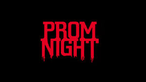
Another part of our research for our trailer we had to analyse typical titles in a horror trailer. it is very clear from looking at a number of opening titles that they all contain similar colouring and fonts. To help us create the perfect title for our film and make sure that it fits our genre of 'Horror' we analysed different titles used for other horror films. The opening titles we looked at include, 'Evil Dead', 'Prom Night' and 'Drag me to Hell'. It is very common in Horror films for the opening titles to have a black background, this is because it allows the audience to focus on the title, it also suggests the film is full of darkness and horror. The black backgrounds also doesn't give anything away about what the film is actually about which will also draw the audience into the title and try to work it out. It also suggests that that something could jump out from the background and this will make the audience become on edge. The red titles also connotes blood, this suggests that a lot of anger and violence is also going to be involved in the film which will also encourage the target audience to want to see the film. 

Image result for horror film titles

This title is a darker red which also contains shadows, the shadows look as if they are roots which are trying to suffocate the title, this suggests that something in the film is going to try and hurt someones life. The title adds a lot of questions from the audience because the title does not give any information away. The back background also adds a very eerie effect and it also makes the red title stand out a lot, which makes the title stand out. This suggests that it is a very successful title and this is what our title should look like. 


Image result for horror film titles

The title 'Prom Night' is a very successful title, this is because automatically when the audience think of a prom night they think of young adults leaving school and its meant to be a very exciting time in their lives, this will add a sad but eerie effect to the film because if the audience are parents and have children of that age it will automatically make them think of their children and this could make them feel sad. If the audience is the age of the suggested victims in the film then it will make them scared and make them think that it could be about them. This will make the film successful as its aim is to scare people.


Image result for horror film titles

This title is quite different to the other titles as the writing is white, although the background and the colour of the writing are opposites the writing does not stand out as much as it could this is because the white colour is quite dirty, suggesting the film could be set in a dirty, old place. This title does not look very scary either suggesting it might put the audience off going to see this film. The idea of 'Hell' is quite eerie and is seemed to be scarier because of the fear of the unknown. The idea of being 'dragged' is also very horrific because it suggests the body being dragged will either not want to go or the person is dead and being pulled down there. This suggests that the look of the title is not very scary but the wording has made this title scary. 


Actors, Props used;

Actors, Props used and Interviews:


Main Actress: Our main actress is Hannah Munro, she is the protagonist in the film and she is in danger whilst she is walking her dog. She conforms to the expectation of a victim in a horror film because she looks very innocent. Her clothing will also show her purity as she will be wearing white which is a very delicate colour.

Side character: In parts of the film we will have different characters which will be in little shots. One of the characters will be me (Lydia Horgan) i will be driving a car and Hannah will be sat in the back looking very distressed, this will hopefully make the audience feel on edge and want to know who is driving the car and why she is in the back looking so upset. The audience will hopefully be asking questions which are like: Has she been found? Why is she in the back of the car?

Another side character: In another part of the trailer we have another shot of a lady (Hannah's mum) who is also Hannah mum in the trailer. Again she isn't in the trailer for a long time but she is the character which finds out Hannah is missing. She finds out she is missing because Hannah's dog finds his way home alone.


Props:

We will be using Hannah's dog in our film to also show her innocence and to show that she was unaware that someone was watching her and that she was going to be taken. Hannah dog 'Marley' will also run home which is when Hannah's mum will see that the dog is alone and that there must be something wrong. 

We will also be using fake blood which will be left on the tree to show that something bad has happened to her. This will also conform to the conventions of a horror film as it will suggest that something bad has happened. 


Friday 23 December 2016

Results of the questionnaire:


RESULTS:


We created a questionnaire to find out what peoples favourite genres were and also created questions surrounding what we should name our film and other added features within our film to make sure it appealed to the widest audience possible. We gave our questionnaire to 30 random people of all different age ranges to give us a variety of results.


What is your favourite genre of film?


Are you male or female?


How old are you?


Do you watch horror films?


What rating do you normally expect a horror film to be?


What would make you want to go and watch a horror film?


Thursday 8 December 2016

interview:

This is our interview of our main character Hannah. 

Using the Green - Screen

Experimenting with different filming materials:

When deciding on different ideas on how to film our Horror Trailer we decided to play around with the Green - Screen. We set it as if we were filming the news and the top story was someone who had gone missing, which is our trailer story line. It did work really well, although we couldn't use the footage as Hannah was the one we were practicing with and when we started filming she was also the one who was taken and is the victim in our trailer so it didn't work. Although this was the case it was very good experience and it was good to experiment with different filming materials. If i was to film again i would definitely consider using a green screen. The lighting used was also very effective as it highlighted the important parts of the character and her surroundings.  


Wednesday 7 December 2016

Questionnaires:

Questionnaire and feedback:


How old are you?

       0 – 11 years

        12 – 14 years

        15 – 17 years

        18 – 29 years

        30 – 39 years

        40 – 49 years

        50 – 59 years

       60+ years


Are you male or female?

Male

ÿ        Female


What is your favourite genre of a film?


ÿ        Romance

ÿ        Action

ÿ        Adventure

ÿ        Comedy

ÿ        Crime& gangster

ÿ        Drama

ÿ        Historical

ÿ        Horror

ÿ        Musical

ÿ        Science fiction

ÿ        War

ÿ        Chick flicks

ÿ        Fantasy

ÿ        Sports

ÿ        Thriller


Why is this your favourite genre of film?


………………………………………………………………………………………………………………………………


Do you watch horror films?


ÿ        Yes

ÿ        No

If (Yes) Why do you watch horror films?


………………..……………………………………………………………………………………

If (No) what would make you watch a horror film?


………………………………………………………………………………………………………


Which of these three titles do you think would suit a horror film?

ÿ        Gone missing

ÿ        Taken

ÿ        Snatched

  
Why does that sound like a good title for a horror film?


……………………...………………………………………………………………………………

What age rating would you normally expect a horror film to be?


ÿ        U

ÿ        PG

ÿ        12

ÿ        15

ÿ        18

        What do you stereotypically expect to see within a horror film?


1. The power is shut off

2.    Someone investigates a strange noise

3.      The phone line is cut off

4.     The victim falls in front of the antagonist

5.      Vehicle won’t start

6.      Someone is killed in the first 5 minutes


7.      A stormy night


Friday 2 December 2016

Practice titles created and uploaded:


Practice titles created and uploaded:


The title of our trailer links really well to the story line and it adds mystery to the trailer, although this is the case it also gives an indication to the audience about the film and what it is going to be about. To decide on the name of the trailer we put a few different names together which we thought would be good and we applied them to our questionnaire to get the target audience to decide what would stand out to them the most. 


All of our titles were created using 'Adobe Premiere Elements'. We also used the snipping tool to cut down the title and this was very helpful when getting the title into its size. We decided as a group to use capital letters in both of the titles to make it stand out and make the tile look dramatic and dynamic and this will hopefully suggest that the trailer is going to be full of horror and drama. 

The colours used in both titles are white with black backgrounds, this allows the titles to stand out from the black background. The white colouring also shows innocence which suggests our main character is a young girl who is unaware if the danger she is going to be in. As a group we decided that the second title, the font used was 'Adobe Casion Pro' which made a white outline, this adds a creepy effect, suggesting the middle title has been cut out. We decided it was the best title because it is not as innocent as the first title and it links more to our horror trailer. 

We have also decided that the title will be at the end of our trailer and it will be featured in the trailer for around 3 seconds and we will add an effect to the title. We will aim to do something which will fade in and fade out and the non diegetic sound will have a deep sound and this will hopefully stay in the audiences head and they will remember what the film is called. This will be a good ending to the film. 


Thursday 1 December 2016

Soundtrack Research:

Soundtrack Research:


When experimenting with different soundtracks for our trailer, it didn't challenge us too much
 because from the start we all agreed that it was a very moving creative idea to have a 'nursery rhyme' sung over the top of the trailer. To begin with we researched different nursery rhymes but none of them stuck as well as they could without making our trailer childish and laughable. We also decided to get one of our group members to sing the nursery rhyme which we finally decided would be 'teddy bears picnic' the reason we chose this nursery rhyme is because it links to the forest/woods and is  a very well known nursery rhyme. 

We also trialled 'Hannah' singing, whispering and humming the nursery rhyme to see which one would be most successful and link to a horror trail to make it as scary as possible. We decided to go with Hannah whispering the song  because it sounded the most eerie and it is hard to tell the age of Hannah meaning a child could be singing it, meaning that people watching the trailer could be being haunted. 

Storyboard:

Storyboard:

We created rough sketches for our storyboard as a plan for our film. Although we did not use this as our final ideas, it was a useful planning process. It also shows the audience how our ideas grew and became a lot more successful.