Opening Titles Analysed:
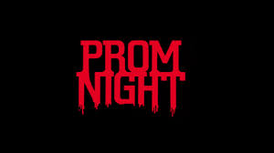
This title is a darker red which also contains shadows, the shadows look as if they are roots which are trying to suffocate the title, this suggests that something in the film is going to try and hurt someones life. The title adds a lot of questions from the audience because the title does not give any information away. The back background also adds a very eerie effect and it also makes the red title stand out a lot, which makes the title stand out. This suggests that it is a very successful title and this is what our title should look like.
Another part of our research for our trailer we had to analyse typical titles in a horror trailer. it is very clear from looking at a number of opening titles that they all contain similar colouring and fonts. To help us create the perfect title for our film and make sure that it fits our genre of 'Horror' we analysed different titles used for other horror films. The opening titles we looked at include, 'Evil Dead', 'Prom Night' and 'Drag me to Hell'. It is very common in Horror films for the opening titles to have a black background, this is because it allows the audience to focus on the title, it also suggests the film is full of darkness and horror. The black backgrounds also doesn't give anything away about what the film is actually about which will also draw the audience into the title and try to work it out. It also suggests that that something could jump out from the background and this will make the audience become on edge. The red titles also connotes blood, this suggests that a lot of anger and violence is also going to be involved in the film which will also encourage the target audience to want to see the film.
This title is a darker red which also contains shadows, the shadows look as if they are roots which are trying to suffocate the title, this suggests that something in the film is going to try and hurt someones life. The title adds a lot of questions from the audience because the title does not give any information away. The back background also adds a very eerie effect and it also makes the red title stand out a lot, which makes the title stand out. This suggests that it is a very successful title and this is what our title should look like.
The title 'Prom Night' is a very successful title, this is because automatically when the audience think of a prom night they think of young adults leaving school and its meant to be a very exciting time in their lives, this will add a sad but eerie effect to the film because if the audience are parents and have children of that age it will automatically make them think of their children and this could make them feel sad. If the audience is the age of the suggested victims in the film then it will make them scared and make them think that it could be about them. This will make the film successful as its aim is to scare people.
This title is quite different to the other titles as the writing is white, although the background and the colour of the writing are opposites the writing does not stand out as much as it could this is because the white colour is quite dirty, suggesting the film could be set in a dirty, old place. This title does not look very scary either suggesting it might put the audience off going to see this film. The idea of 'Hell' is quite eerie and is seemed to be scarier because of the fear of the unknown. The idea of being 'dragged' is also very horrific because it suggests the body being dragged will either not want to go or the person is dead and being pulled down there. This suggests that the look of the title is not very scary but the wording has made this title scary.


No comments:
Post a Comment